Figure & Ground in Film
December 7, 2012I took a Visual Communication class during my third quarter of graduate school in the Human Centered Design & Engineering program at the University of Washington. Our very first reading assignment introduced the fundamentals of the Gestalt theory of perception, and its concepts of figure and ground. Very very basically, this means that your eye and brain tend to want to perceive a distinct and immediate thing on top of a relatively indistinct and distant field.
The following totally banal-seeming line kind of blew me away.
“…the visual form recognition process requires the presence of light so that the eye and brain can perceive contrast between the form and the background.” — Basic Visual Concepts and Principles
Light! Contrast! That’s what allows your eye to make out shapes and identify them as objects. This got me thinking about why the visual style of modern movies bothers me so much, and I think I’ve got it: the contrast is stronger within the figures and within the ground than it is between the figure and the ground.
On top, a frame from the Total Recall remake, which just happened to be the latest teal & orange film I’d seen a trailer for when I started thinking about this. On the bottom, a frame from North by Northwest, Hitchcock’s 1959 classic.
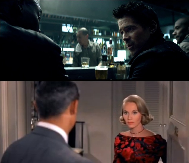
Notice anything different about them? Like, that in one of them you can see stuff? Allow me to use some Photoshop filters to make my point. Here are those same two frames pixelated all to heck:

Whoa, in the Hitchcock frame, you can still tell that a very Cary-Grant-lookin' pixelblob is talking to a very Eva-Marie-Saint-lookin' blob. In the Total Recall frame, the most contrasty and interesting thing in the frame is the jumble of light-on-dark tealish pixels in the center, not the pitch-black silhouettes on the periphery. Now let’s try Stamp:
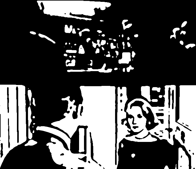
This makes the point even more strongly. Photoshop has no trouble finding the contours of the human figures in the Hitchcock frame, but the Total Recall frame is reduced to a undifferentiated cloud of white globules.
This is all not to say that film is terrible now and the medium should have been frozen in time 50 years ago. I recognize that viewers are more sophisticated now, and they don’t need the scene as literally spelled out for them in order to enjoy a story. This style clearly works and is appreciated by fans, because it’s taken over so much of film. I’m probably just weird.
But it’s been valuable for me to discover why I personally don’t tend to enjoy the prevalent visual style at this moment in film history. I like to get a sense of the surroundings of a scene that’s rarely conveyed by these cramped, dark shots. I like to visit a world that’s more colorful than reality, not less. I love when light, color, and shape combine to create wonderful, iconic, memorable images that inspire and dazzle people.