I Really Want to Understand Vibrancy
October 10, 2014Hello
I have been trying to reserve judgment on the design of OS X Yosemite until we had some official design guidelines. Well, Apple has invited developers to start submitting Yosemite apps, and we still have no idea how the trademark visual-design feature of this OS is really meant to be used.
At WWDC 2014, Apple explained how to implement vibrancy effects in our apps, but didn’t mention anything about what it means. The only design-related explanation for it is this vague bit from the Yosemite preview page:
Translucency adds more dimension to your desktop. By adding translucency to certain interface elements in OS X Yosemite, we’ve put a greater emphasis on your content. Translucent toolbars let you know there’s more to see than what’s visible in the window as you scroll. And a translucent sidebar lets you see what’s hidden behind the active window. So the interface takes on the look of your desktop image and your content — making your Mac experience different from anyone else’s.
I’ve really tried to understand vibrancy in terms of Apple’s stated design values of deference, clarity, and depth. I’ve also done my best to make sense of it in terms of that marketing language above. But I still feel really confused, and for the first time in a decade of designing for Apple platforms, I am in the weird situation of feeling obligated to adopt a design feature I can’t really bring myself to believe in.
What follow are my thoughts as I tried to make sense of it all.
“Deference” — Maybe it’s to help the content come to the fore, while the chrome blends into the background
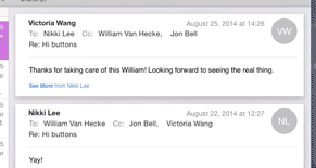
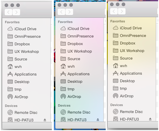
On Mac, your sidebars (and random other chunks of windows, like behind threaded Mail messages) all show through to whatever happens to be behind. All the examples Apple shows use some beautiful desktop, but in real life that’s almost never what is behind it for me. Sometimes it’s a mostly white or gray window, and my sidebar turns gray. Sometimes it’s some colorful image, and my sidebar turns a random assortment of vivid blobs. Sometimes it’s the frantic video for the totally rad Doll$boxx song I’m listening to on YouTube. This sounds like a contrived example, but it’s not at all unusual at all to have a video playing in the background while you do other stuff.
It would be more deferential to let you move the stuff you’re interested in to the forefront, and block out the stuff you’re not interested in. Not to arbitrarily allow stuff you’ve set aside to show through into what you’re trying to work on.
Frustratingly, this effect only happens on the foremost window. Background windows go opaque gray. Thus the window you’ve chosen to focus on looks less substantial, and is less in charge of its own contents, than the ones you’ve set aside.
Bringing a window to the fore is a decision that the user makes about what they want to focus on; vibrancy that shows through the window harms that.
“Depth” — Maybe it reinforces the z-order layering of elements on the screen.
Maybe it’s to let you know that there is more content to scroll to above or below the boundary of the view. But this is super hit-and-miss, depending on the saturation of the stuff going under the vibrant bar.
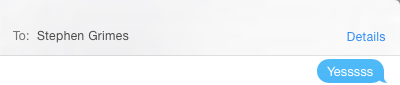
There is a gray bubble behind the bar, just barely noticeable if you know to look for it:
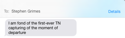
Now there is a blue bubble behind the bar, which can’t be missed, and is actually quite distracting:
In most typical-looking documents made of dark text on light backgrounds, the vibrant toolbar just flickers and sparkles in a vaguely glitchy-looking way as you scroll around, with no real sense of benefit.
Bottom bars in Apple’s Mac apps aren’t vibrant, but top bars are. Both top and bottom bars are vibrant in Apple’s iOS apps. Why?
In windows whose content scrolls horizontally, when the the content passes into the area occupied by the translucent sidebar, it simply disappears. The background windows or your desktop are visible behind the sidebar instead. Where did that stuff go?
In Safari, stuff you’ve scrolled off the main view, presumably because you’re finished with it, suddenly becomes in charge of the appearance of the window frame. Scrolling is a decision that the user makes about what they want to focus on; vibrancy in toolbars harms that.
“Clarity” — Maybe it’s to help you identify source lists, toolbars, or other standard interface elements.
Depending on what happens to be behind your source list, it will be colored completely differently. When it’s in front of a document, which tends to consist mainly of dark text on a white background, it’ll look flat gray. When it’s in front of an image, it’ll look like a blurry, hyper-saturated version of that. When something happens to split the area it covers, it’ll seem to have an arbitrary separation partway through it. This doesn’t help identify a source list any better than the standard corpse-blue gradient it had before. It doesn’t do anything helpful at all. Instead it destabilizes the appearance in a capricious, random-seeming way.
That blue, in contrast to plain white, did the visual-design job of making a source list look slightly weightier than the main content area, because it’s hierarchically superior and controls what you see in the main content area. Now, source lists look less substantial than the surrounding areas of the window. They look like a hole in the window, not the cornerstone of the window’s navigation.
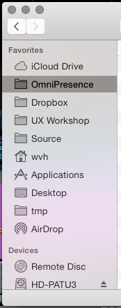
Because of the unpredictability of the effect, depending on what’s behind the sidebar the highlight effect can actually lower the contrast between the item’s text and its background. Here the selected item’s title is harder to read than the deselected items’.
Overall, it adds noise to an interaction that used to be clear.
“Delight” — It looks cool and it’s fun to play with.
This is the only explanation that rings true. “Delight” is not one of Apple’s stated design values. In recent years, as it talks about its design philosophy, they’ve shied away from the idea that they make things fun just for the fun of it, and leaned towards the idea that technology should always have a functional, rational purpose. That you can use that simple, reliable technology to make your own fun, in the real world.
Sometimes, though, it feels like Apple still holds “Delight” as a secret design value. This vibrancy stuff pretty much feels like a pure “delight” feature that they are trying to dress up as a serious, straight-faced design decision. That could be fine, if it didn’t fall down in so many ways as to make it more frustrating and confusing than it is fun. If there were any rules at all about how it’s intended to be used to help people get things done.