Ar tonelico 3 impressions
March 23, 2010I gave up on the guy in Japan sitting on my Ar tonelico 3 Saikyou DX Combo box, and just ordered another copy of the game. Now I’m about 30 hours in, having forcefully inserted some gaming hours in the cracks of my iPad development schedule.
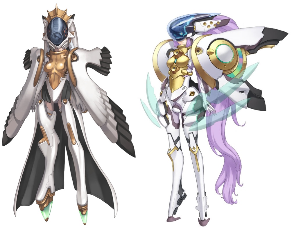
First, the artwork. From the first Famitsu scans that came out, I was kind of worried about the visual style of the game. It seems so flat and imprecise, compared to what we expect from Nagi. It’s most obvious in the portraits for the Origin Reyvateils in Ar tonelico 1 and 3. Nearly every surface of Shurelia’s Linkage suit is rendered with a continuous, careful blend of highlight and shadow, creating a hyper-idealized, tangible presence. Tilia’s Linkage, in comparison, looks like a sketch, with either flat fields of shading or indistinct gradients.
Perhaps Nagi had to rush through the greater number of significant character portraits this time around. Whatever the reason, this is part of why I’ve had trouble getting very attached to any of the characters. The other part is the multi-personality heroines: instead of spending the game with one heroine, discovering her complexities, you spend it meeting a small crowd of one-dimensional characters.
Gust’s forte has never been real-time battles, precise control schemes, or solid character movement. Ar tonelico 3’s real-time battle system seems to be a random number generator, with your button presses as the seed. When my characters die, I don’t know what I did wrong, other than fail to spam healing items. When I win, I don’t know what I did right, other than to stare at the Harmo graph, ignoring the actual battle, and mash Square whenever I see red. Ultimately, I don’t feel in control, challenged, or powerful, which are the most important things to feel in a battle system. I wish Gust had stuck to adding their own twists to traditional RPG battles, rather than trying for the action RPG.
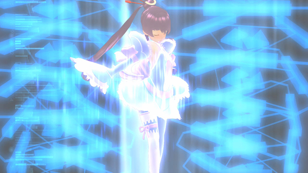
The notorious Purge mechanic is, even considering its questionable premise, disappointing. The goal is titillation, but the reality is monotony. I’ve seen precisely the same costume-disintegrating animations, from precisely the same angles, with precisely the same absurd boob-jubbling effects, enough times for them to be more irritating than alluring.
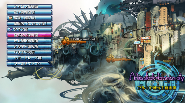
The dungeons are are huge, desolate, featureless mazes. The world map is weak, offering the tower no sense of grandeur. The floaty, misanimated jumping could be the most embarrassingly bad character movement I’ve seen. What I’ve seen of the Cosmospheres is more silly than engaging. I might have had more fun meeting the more mysterious characters, if every one of them hadn’t been completely exposed on the web site first. At least the towns are gorgeous and loaded with personality.
A baffling extra failure is in the interface design, which shouldn’t be difficult for a company that’s been creating RPGs for a decade and a half. Some of the simplest conveniences we take for granted are inexplicably missing. At a shop, you expect to be told how the selected item compares to what you have equipped; if you buy the item, you expect to be able to equip it right away. Here’s how you figure that out in Ar tonelico 3:
- Open the store menu, and select an item.
- Memorize the stats of the item.
- Leave the store menu.
- Open the equip menu and navigate to the character.
- Memorize the name of the equipped item.
- Leave the equip menu.
- Open the Items menu.
- Locate the item you have equipped.
- Check its stats, and compare them to the shop item.
- If it is more powerful, buy it.
- Leave the store menu.
- Open the equip menu.
- Find the item you just bought, and finally see the numerical comparison to what you have equipped.
- Realize you miscalculated, and you didn’t want to buy that item after all.
So, there is my complaining, for now. I actually hope, almost expect, to be proven wrong. Gust has a history of introducing surprises well into a game, and negating my negative impressions. I still haven’t got the third Reyvateil (though I am fairly sure I have met her). There could still be a lot more story, a lot more Cosmosphere, a lot more enjoyment to be had. My secret wishes are that there are two secret heroines, that all of the heroines' personalities will end up having Cosmospheres of their own, and that there are way more main-story Phases than we think. Any of these could still be true. They could even release a patch that fixes some of the technical problems. There is downloadable content in the works. Ar tonelico 3 still has a chance to live up to the lavishness of At2.


