Video Game Logo Localization
April 27, 2010Here’s something I’ve had my eye on for quite a while.
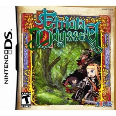
An admirable but oft-unnoticed component of a good localization is properly adapting the foreign-language title and logotype. My gold standard for this practice is Atlus USA’s treatment of Sekaiju no Meikyuu, or, as they cleverly renamed it, Etrian Odyssey.
Recently Atlus posted about the design process for the original distinctive logo.
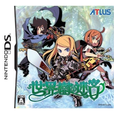
At the Atlus USA Etrian Odyssey site, there are fascinating accounts of how they adapted the name and logo. (Unfortunately, you’ll need to navigate their Flash thingy — Columns, Localization Stories, Page 4.) The result is a rare case of a localized game box that’s even better than the original. It’s brilliant, and a design I’m proud to have on my shelf. (Thanks to Into the Labyrinth for the image.)
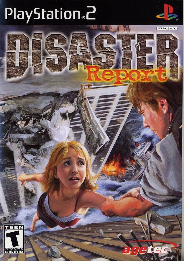
Most games don’t get a chance to shine this brightly on American shelves. One fine example of distinctive Japanese game box design is Irem’s Zettai Zetsumei Toshi — this game caught my eye every time I visited the used game shops (particularly at Liberty in East Shinjuku). It’s a striking, intriguing design, even on Japanese shelves full of striking, intriguing designs.
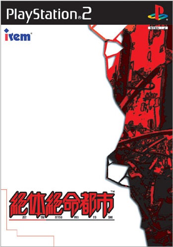
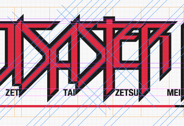
The American cover, while I must give it credit for being hand-painted, doesn’t compare. Disaster Report is a commendable choice of English title, but the Photoshop-filter-crazy rendering of it is particularly disappointing.
I wish they’d kept the bold original design and just adapted the logotype. As a challenge to myself, I tried it. I’m pretty happy with the result!
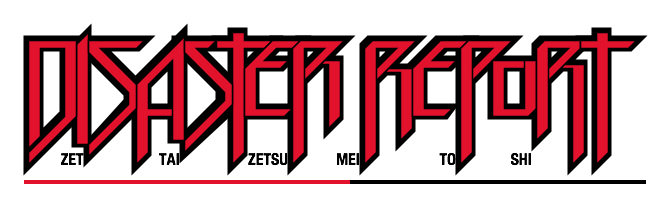
The OmniGraffle file ended up pretty intricate.